-
•
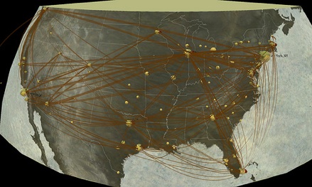
Disease Model: The U.S. network model for influenza transmission. Sphere sizes represent numbers of inhabitants and ribbon opacity and height represents the number of infected travelers.
This work is the result of a collaboration between domain scientists, visualization scientists and a fine-artist.The visualization tool was developed using Processing and uses geographical spatiotemporal views to explore the model dataset. The tool is interactive and easy to use. Close attention was given to visualization design aesthetics to create visualizations that can be easily understood by the general public.
Credit: Karla Vega, Kelly Gaither, Francesca Samsel, Gregory P. Johnson, Nedialko Dimitrov, and Lauren Ancel Meyers